You have rewritten the headline six times.
You moved the screenshot. Added three feature cards. Deleted them. Put two back. Tried a gradient, decided it looked too AI, and removed it again.
The page looks different now. The important question is still unanswered:
Does anyone understand why they should care?
You cannot answer this by staring at the page for another hour.
Founders are usually the worst judges of their own messaging. Not because they are bad writers, but because they know too much. You know what the product does, why you built it, what each feature means, and how all the pieces connect.
When the copy leaves something out, your brain kindly puts it back in.
New visitors are not that kind.
They give you one or two glances, make a quick guess, and leave.
So before you redesign the page again, give it five minutes with a human being.
Show them only the first screen
Take a screenshot of the part someone sees before scrolling: the headline, subtitle, main visual, and CTA.
Show it to someone for five seconds. Then hide it.
Ideally, choose a person who could realistically have the problem you solve. They do not have to be the perfect customer. They just need enough context to recognize the situation.
Your mom saying “it looks very professional” is lovely. It is not message validation. (sorry, moms)
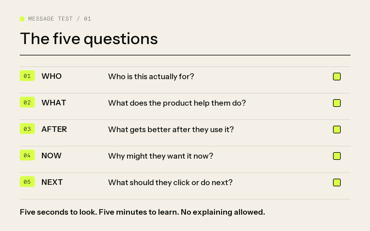
Ask five questions:
- Who do you think this is for?
- What does the product help them do?
- What gets better after they use it?
- Why might they want it now?
- What would you click or do next?
Now comes the difficult part.
Do not explain.
Do not say, “Oh, that’s because this feature actually…” Do not give them the context you wish were on the page. Do not rescue the copy.
Every time you want to explain something, write it down. That missing explanation may be exactly where the message breaks.
Score the message, not the person
Give the page one point for each answer that is close to what you intended.
This is not a scientific conversion model. It is a quick way to notice whether the important ideas survived the trip from your head to someone else’s.
5/5: The first screen is clear. Leave it alone for a minute and get more people to see it.
3–4/5: The core is there, but one part is too vague or too quiet.
0–2/5: Do not add another section yet. The first screen does not know what job it is doing.
And please do not blame the tester for “not getting it.”
One person may misunderstand. If three people misunderstand the same thing, that is not a people problem. That is your copy giving you data.
Unclear pages usually have a priority problem
When a page is unclear, the instinct is to add more words.
More features. More screenshots. More explanation. Perhaps one more impressive sentence about transforming the future of work.
It rarely helps.
Your page may not be missing information. It may simply be asking five ideas to speak at the same volume.
Fix them in this order:
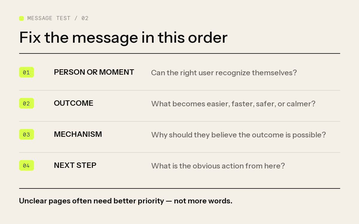
1. The person or moment
Can the right user recognize that this might be for them?
“A smarter workspace for modern teams” could be for almost anyone. That sounds like a large market. In practice, it means nobody feels specifically seen.
Compare it with:
For agencies tired of chasing client feedback across email, Slack, and calls.
Narrower? Yes. That is the point.
2. The outcome
What becomes easier, faster, safer, calmer, or more profitable?
Your product may “centralize feedback with AI-powered collaboration.” Fine. But the user probably wants to get the design approved without another week of confusing messages.
Lead with the life they want, not the machinery you built.
3. The mechanism
Once the outcome is clear, give people a believable reason the product can create it.
This is where the feature belongs.
Not twelve features. Just enough to answer, “Okay, but how?”
For example:
Get client feedback approved without another status meeting. Collect every comment directly on the design, keep decisions in one thread, and turn approved changes into tasks.
The outcome earns attention. The mechanism earns belief.
4. The next step
Make the CTA match the amount of trust you have earned.
If the product is simple and self-serve, “Try it free” may be enough. If it requires setup, access, or a bigger decision, “See how it works” or “Book a demo” may be more honest.
Do not spend an afternoon inventing a cute CTA. A clever button cannot save a confused page. It only needs to make the next action obvious.
Polished can still mean empty
Here is the kind of message we have all seen:
The intelligent platform for seamless team productivity Use AI-powered workflows, real-time collaboration, and advanced analytics to unlock your team’s full potential.
It is polished. It also makes the visitor do all the work.
What kind of team? Productive at what? Which workflow? What painful thing disappears?
Now compare it with:
Know what your team is blocked on before the weekly meeting Collect daily updates in Slack, flag stalled work automatically, and get one short summary every morning.
Less grand. Much clearer.
You can picture the user, the problem, the outcome, and how the product works. For an early-stage product, that is a very good trade.
Your homepage does not have to be the testing ground
Before a new message earns a permanent place on the page, try it somewhere cheaper.
Turn it into a short post. Use it in a reply where someone is describing the problem. Put it at the top of a cold message. Say it during a user call.
Then pay attention.
Do people ask a relevant follow-up question? Do they tell you their version of the problem? Do they click because the sentence is interesting, or because they recognize themselves in it?
Small reactions can tell you which message deserves more space.
Stop explaining. Start observing.
Your landing page does not need to tell people everything.
It needs to help the right person understand enough to take one next step.
Who is this for? What painful situation does it help with? What gets better? Why should I believe it? What do I do next?
If the first screen answers those questions in a few seconds, stop polishing it for a while. Put it in front of actual people.
At some point, another hour inside Figma stops giving you answers.
A confused face will.